The song I originally chose to use was 'Breezeblocks' by Alt J which is a song from the indie rock/ alternative genre. However, half way through my project, due to lack of availablity from the cast members I decided to re story board and change the narrative and song choice of my music video. I chose to use 'Fitzpleasure' a song that is also from Alt J and due to the bands nature is also a song from the indie rock/alternative genre so therefore all my previous research into the conventions of music videos and the indie rock genre still applied to my campaign. Before starting to plan my campaign I had to reserach into the conventions of form and genre, to understand what I needed to include in my music video to make it look industry standard. I conducted an analysis of music videos, researched into the history of music videos and researched into the background of indie rock.
From looking at the history of music video's it gave me an idea as to how music videos have developed over time and how the different forms of narrative have occurred. It also allowed me to understand the basic form conventions of music videos. Therefore from this research and the analysis on music video's I produced a Prezi that I could relate back to for the information I found on the conventions of music videos in relation to Mise-en-scene, Cinematography, editing and sound.
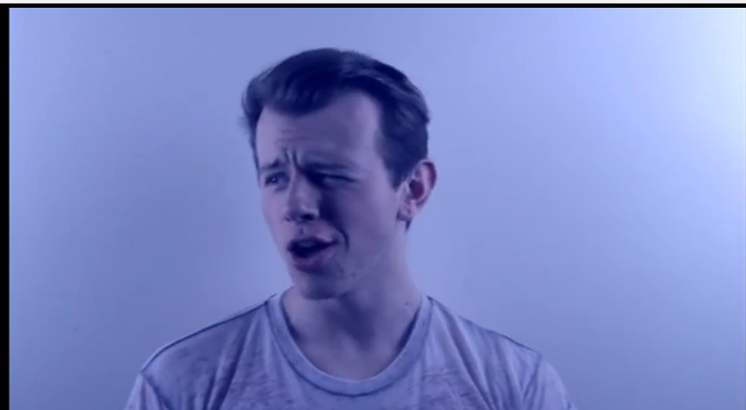
The conventions of form include fast pace editing and editing on the beat of the song, an element which can be seen in my music video. This is to keep the audience entertained throughout their viewing and to reflect the mood of the song in some cases. Another convention of form is to use a variety of shots, such as close ups, extreme close ups - normally used for lip sync- medium close ups and long shots. Long shots are the most infrequent and are used as establishing shots to set the scene. The most frequent shots are close up's and medium close up so the audience can see the facial expressions of the artists and can establish the mood of the song. Shot such as tilts, pans and tracking shots are also conventional to form as the help the audience to follow the narrative of a song and can reflect hidden meaning to the narrative of the lyrics. They could also be used simply to just follow the artist. A range of different shots used in my music video is a way in which I used conventions of form. Also, I found it was conventional in indie rock music videos to have the main artist lip syncing with medium close up shots. However I challenged conventions by using extreme close up shots of a lip sync that are normally used in pop music videos. I did this because I wanted to portray an aspect of rebellion within the cinematography that is connoted with the label of indie rock. It is important that varied shots are used within a music video and shots at different angles so therefore I used as many different types of shots as I could. In the New York scenes I wanted my audience to feel involved with the on screen shots and to do this I used a handheld camera that allowed me to capture shots from my perspective and additionally, the audience's perspective.
Close up shot. Double exposed upwards tilt.
Extreme close up shots.
Self reflexive long shot.
Medium close up shot.
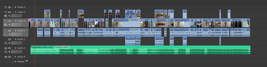
The screen shot of my music video on Adobe Premire pro CS6 shows the fast pace editing through the shot vidoe clips present and the performance clips which look longer are then double exposed with abstract clips of New York scene. From watching my video it is evident that the clips are edited to the beat of the music to keep with conventions of form. Additionally, the longer performance shots are also double exposed with juxtaposed fast pace shots of New York shots and extreme clops up lip sync shots throughout.
After identifying the conventions of form I then looked at identifying the conventions of my chosen genre - Indie Rock. I conducted several analysis' of indie rock music videos to be able to identify the conventions of the setting, narrative, Mise-en-scene in relation to costume and props, editing and cinematography.
I found that the artists appearing in indie rock music videos tend to have plain t shirts on and jeans, predictable everyday attire in comparison to pop videos who's music video consist of them in surreal settings and wearing over the top clothing to accompany the setting. For this reason I chose to have Brandon wearing a plain white and plain distressed look t shirt for the performance element of my music video to stick to conventions. However,indie rock music videos tend to be set in everyday settings to create social realism and have elements of performance juxtaposed with either a narrative or abstract scenes that have no real meaning other that iconography reflecting the lyrics. I challenged conventions of an everyday setting to create social realism by having the main bulk of my music video set in New York. I chose to do this as I wanted a more arty feel to my music video rather than sticking to the everyday life feel I wanted to bring an element of wonder to indie rock rather than the typical day to day - what you see, is what you get aspect. I also reinforced this challenge of conventions by using colored effects over the performance images rather than having the clips in black and white - which is a convention of indie rock, an element which indie rock band Arctic Monkeys use frequently in their video. Additionally, I challenged the conventions of indie rock and music videos by have frequent cross dissolves in my music video instead of straight cut edits that are conventional. This was again to create the arty aspect and I felt by having cross dissolves it accompanied with my chosen song better. I still used a few straight cut edits when the tempo of the song increased. Another way in which I challenged conventions of genre is by not using props such as instruments at any point in my video as I felt it wasn't necessary for my music video to feature them due to the styling of the song being more edgy and alternative then the standard indie rock. It is hard to analyse conventions on Alternative music because the artist essentially plays around with their own styling etc. The use of harsh lighting to create shadows is also a convention of indie rock and I tried conform to this convention by altering the input of the lighting whilst editing. I did not create as much of a shadow behind and on the cast member as I would have liked and should have altered the lighting whilst filming instead of trying to add them whilst editing.
The challenging and conforming of conventions can be seen in my video in comparison to and indie rock music video - R U Mine by Arctic Monkeys.
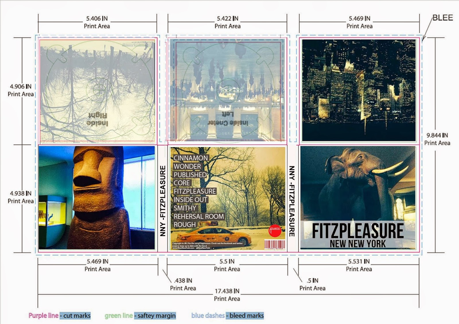
To accompany my music video I chose to produce a magazine advertisement and digipak as part of my campaign. I researched the conventions of both magazine advertisement and digipaks both on the internet - web 2.0- and on print. Once I had established the conventions of magazine advertisements and digipaks in the indie rock genre, I produced an analysis of conventions and began planning my own media products.
After analysing magazine advertisements I carried over all of the conventions as I feel it looked very effective and tell the audience all the need to know about the album and when its released. I used the same image as my digipak cover to create continuity between my products and to create audience recognition when searching for the album in store. Like the image on the cover I analysed my magazine advertisement features and intriguing image that could be seen as surreal.
The artists name it also clearly presented in the centre of my advertisement as well as the album name. I chose to place these two together to create a relationship between both the band and the album. They are both big and bold to stick with conventions and are easy readable for my target audience. I chose to use the release as 'out now' instead of an actual release date due to the fact I personally forget about when the album is released if I have seen it on a poster therefore I wnated my media material to be available at the instant to my audience. To stick with conventions I chose to have this written in red so it is the brightest element to my advertisment.
Feedback from successful and popular media institutions are also conventional to form so therefore I chose to feature feedback from both NME and MOJO as a selling point for my media product.
Due to the age of my target audience and their familiality with social media I chose to fetaure the bands links to social media sites to relate to my target audience and promote their relationship with the band.
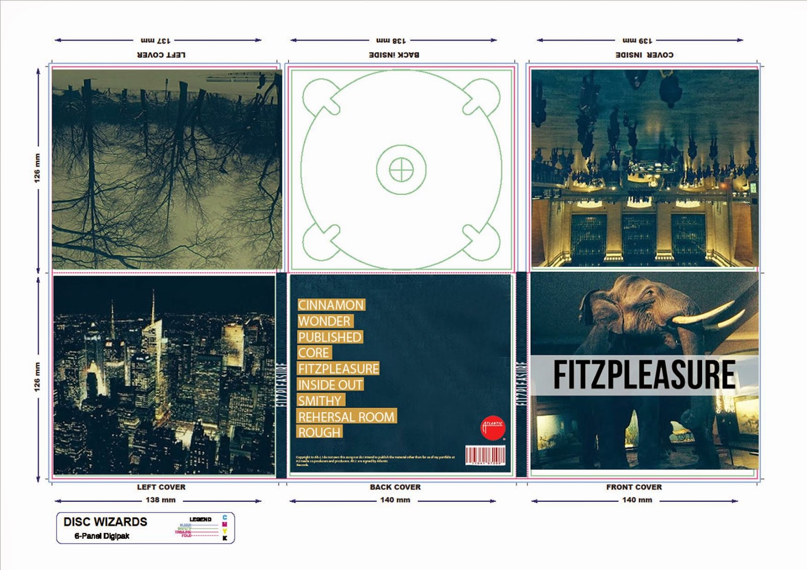
In relation to conventions of digipaks I also conformed to all of the conventions as I felt they were very effective as a selling and informative point. The same image as my magazine advertisemnt is used on the front cover along with the name and album name also positioned in big and bold font. This helps the audience clearly identify the product. The back cover conventially features the track names alligned to the left and the record lable logo. Barcode, copyright issues and further information is also placed on the back cover - a convention to which I have also conformed. The main image on my back cover is a different image to my fornt cover, yet continues the theme of the digipak with New York images inside. The back cover image is very eye catching as the yellow cab stands out in contarst to the rest of the image. Additionally I chose to have the track names featured on a grey background and in white writing to make them easy to read and to make them stand out against the image also.
Before starting the planning for my media campaign, I first had to define my target audience in order to tailor my products to fit their expectations and include additional items that may be of interest to my target audience.To understand just who was interested in my blog and what genre of music they preferred I created a blog poll to asses whether to aim my campaign at a male or female audience and of what age. I emailed a link to my blog to all the students at Wyke college and asked them to take the quick poll. This poll helped me to understand what narrative choices people of late teenage years like to see in music videos. Several other questions created on my blog included:
Are you male or female? What age are you? How often do you listen to music? What type of music do you listen to?
what type of narrative do you prefer to see in music video?
Of all the number of people that took my blog 95% were female and 5% were male which could have given me a biased result in interpreting my blog poll. 95% of the participants said they listen to music everyday and 57% they preferred the indie rock genre, supporting my statement that indie rock is becoming more popular to the female audience. 60% of the participants said that they preferred narrative in a music video which fulled be decision to create a narrative music video initially.However, during my project I decided to combine abstract and performance allowing me to present my target audience with something new and following the conventions of indie rock with the performance element.
Once I had a rough idea of who I was going to aim my media campaign at I then created a prezi that stated exactly who I chose as my target audience and my reasoning's, such as demographics. I then assessed what other interests they had and created an audience profile that features other factors of interest that this particular audience who like indie rock music are interested in such as Clothing, food items,places to visit and entertainment. My audience profile was an element of my research that I could continue to refer back to when choosing the clothing choices and planning the mise en scene for my media texts.
During the process of creating my campaign, at each stage of a completed draft I created an audience feedback questionnaire that allowed me to assess if my target audience felt my ancillary text was effective in reflecting the genre of indie rock. Additionally I wanted to find out whether they liked the main image and whether they felt as thought the advertisement gave them all the information they needed to know about the album. As my media product was aimed at my target audience I felt as though I needed their input into improvements I could make and what elements they felt were effective.Details into how I used audience feedback and how I learnt from it in relation to my magazine advertisement is explained in the prezi below. Audience feedback played a huge part in me creating a campaign that was tailored to the interests and the views of my target audience and without it I would not have been able to create the products I have to the best of their ability.
I asked two females that were in my target audience age range which magazine advertisement they preferred and why. This helped me understand my target audience and what they felt were effective elements of my ancillary text.
A suggestion from my audience feedback on the name of my band stemmed from the first draft of my magazine advertisement. It was suggested that the name did not quite fit the abstract feel to the campaign and the elements of New York that tied it all together as a whole campaign. I took on board this feedback and created a questionnaire that had several different band name ideas that I administered to a selection of my target audience. From this feedback I would choose my band name. The response I got from my audience feedback was very helpful and there was a unanimous vote against the particular name 'New New York' so therefore I devised a logo and this then became my band name and featured throughout my campaign.
From my audience feedback I found that the name of a band says a lot about the genre and about the type of music they produced and what the band associate with. This is something that never occurred to me prior to doing my audience research.
My first draft of my digipak reflected my first draft of my magazine advertisement as it had the same image and had the same idea of the white text box contrasting the black writing. I chose to use the same style on both of my ancillary texts as I felt it would create audience recognition between the two thus creating continuity throughout my campaign. The back cover of my digipak featured white text and all the conventions of a back cover in the industry. The inside images of my digipak were all the same images and looked very bland and boring. After completion of my first draft I then asked my audience again if they knew what the conventions of a digipak was and if they thought I had stuck to them. I also asked my audience what they thought worked well on my digipak and what they didn't, additionally I asked them what they thought I could improve on and again if they could recognize the genre of my digipak.
Overall Feedback Positives:
The title of the album placed on the white box is effective
The barcode is conventional
Negatives:
The images need to be different
more interesting images
sample with the text being on a different colored background
needs a spine for it to look industry material
I then followed the same process as my magazine advertisement by altering the negative comments and carrying over the positive comments to another drafted version of my digipak. Once I felt this was completed, I then presented my target audience with the same questionnaire and then analysed their feedback. Without the feedback of my target audience I would not have been able to make the suggested improvements and improved my work for the better.
From analysing the conventions of magazine advertisements and digipaks I found it was conventional to use the same image on both the magazine advertisement and the front cover of a digipak. This is to create recognition between the products for my audience if they were to try and locate the album from viewing the magazine advertisement. It was this reason that I intended to keep the same images from my magazine advertisements and use the again on the digipaks. A suggestion to improve was to use all different images inside the digipak to make it more interesting for the audience. I made this improvement to my digipak as well as the other suggested improvements of reducing the opacity of the white box. I changed the layout and the styling of the back cover and also changed the record label I thought my album would be published by, from 'XL Recordings' to 'Atlantic',due to the nature of the record label and the existing artists. However, this time before asking for audience feedback I created a third digipak with a different back cover and styling for my audience to analyse and see which digipak they preferred in comparison to each other.
The preferred digipak was the digipak with the central park back cover with the yellow iconic taxi, however it was suggested that the front cover could have an addition of the band name added in order for the audience to create recognition between the band and the album. So with this feedback in mind I again made the changes and created my final digipak.
Alongside my audience feedback questionnaires collected throughout my drafting of my ancillary texts I also asked for feedback for my music video drafting process and for the finished product. I chose to video a group of individuals who fit my target audience of males and females from the age of 17-27, as I thought this was a way of getting more direct and honest feedback about my product. I conducted a focus group asking them a series of questions such as: Feedback for my digipaks.
Feedback for my music video.
What do you think of my music video?
Do you think you would see it featured in the existing industry?
Do you think the editing looks effective?
What improvements would you make to my music video?
what stands out to you the most?
What genre do you think my music video is?
I also asked a class of 25 students for feedback on my music video and this sis an example of some of the feedback I received.
My feedback helped me to improve my music video to make it look as though it was apart of the indie rock genre with the suggested color change of the performance element. I got positive feedback on the editing and was really happy with the feedback. However, 2 audience feedback sheets wrongly identified the genre of my music video and said they thought it was either Hip-Hop or RnB/Rap. This confused me as I thought I had portrayed my music video to be part of the indie rock genre so this feedback influenced me to edit the music video to include darker shadow and highlights on the performance element as this is a convention on indie rock.
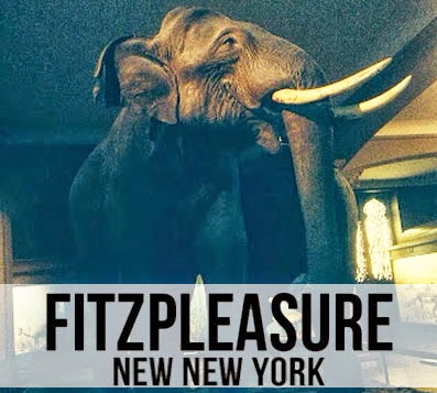
To create my ancillary texts I took plenty of images whilst in New York as I did not know exactly what I wanted as my ancillary texts, all I did know was that I wanted it to featured New York in all its forms such as the nature, the architecture, the history, the people and the new elements to it. I uploaded them to my computer on my return and imported them to Adobe Photoshop CS5, where I tested different editing techniques out in order to get the image i was happy with. From viewing all my photos i narrowed my magazine advertisement image down to two, one of an elephant in the natural; history museum and one of a statue in the natural history museum also. I chose these images as the elephant image creates different connotations for the audience allowing them to be subjective in their interpretations - uses and gratifications theory - and I also chose the image of the statue in the natural history museum as it had neon colours that looked really effective.
Before Editing
These are the images before editing, after looking them on the computer I wanted to edit the brightness and contrast of both images to make them look more vibrant and crisp.
After Editing
I feel as thought altering both the brightness and saturation of both of the images they look better quality images and they follow the abstract theme Intended to create. I then went on to create two drafts of my magazine advertisement with the images as I could not decide which image to use so therefore I asked feedback off my audience. I also used both images in my digipak to create continuity and to reflect the different aspects of New York. Additionally, the image of the statue features in my music video in video format which ties all products created together. I experimented with the layout of my magazine advertisements with both of the images and then went on to ask for audience feedback to see which advertisement they preferred and what elements they felt looked effective in keeping to conventions. From this feedback I found that the most effective magazine advertisement was the elephant image with the main reasoning that this image also featured on the front cover of my digipak. Both of the images feature both in my digipak and in my music video creating continuity between the two.
I liked the layout of the white rectangular box which featured the band name and logo directly in the middle of the advertisement therefore carried this layout over to both drafts of the magazien advertisement and to my digipak front cover. To keep with conventions of magazine advertisements I sized the album name so it was the biggest text on the advertisement to grab the audiences attention. The text on the magazine advertisement is the same font - Bebas Neue, found on 'Dafont.com'- to create continuity between the magazine advertisement and create recognition between the band name and the album name when placed on the digipak allowing the combination of my ancillary texts to work very effectively. Creating the band name was essentially very difficult for me as I really like the original artists name of Alt J as i think its very creative and unique, this gave me the inspiration for me to try to use the same technique on my first draft of my band name of - All- in one' as it thought it was short and simple. However, I knew it did not fit with the new york theme of my campaign as therefore I chose to name my band 'New New York' to reflect the type of styling I wanted to show in my ancillary texts and my music video. This band name went well with my ancillary texts and looked effective on both of the ancillary texts. I then wanted to create other means of contacting the band via social media sites such as Facebook and Twitter so included both of the website address' along with the logo's of both on to the poster. Also to keep with conventions of magazine advertisements I felt as though I wanted to include a verdict of the album from well known music magazines in the industry such as NME and MOJO which helped to promote the album and the music video. The combination of the main images linked all aspects of my campaign to create continuity and effectiveness throughout my products. I showed the development process of creating my magazine advertisement and digipak with screen shots as I created both ancillary texts.
I felt it was important to show both of my ancillary texts as real existing products in the industry so as well as creating edits of my album cover on iTunes I decided to create both my magazine advertisement and my digipak . I printed off my magazine advertisement and placed it inside MOJO to make it look as though it was a real product featured in the industry and asked for feedback on whether the advertisement looked believable. I got good feedback from this and felt happy that I had followed conventions correctly and had made an accurate industry looking magazine advertisement that reflected the abstract digipak and music video. I did this as an alternative way of finding an image of an open magazine and editing it on to the image as I feel this reflected the image as a real life product more effectively.
I wanted to make sure that both my ancillary texts reflected the abstract narrative I wanted to create in my video so therefore used a collection of images I had taken in New York both on my Nikon Coolpix L120 and my Apple iPhone 5. These images were of good quality and once I edited them on Adobe Photoshop CS5 they looked very effective. I chose not to use an image of my main cast member as I felt it would diverge from the abstract feel to the campaign and therefore in my music video I also contrasted the image of the male cast member performing with images on New York. I chose to use mainly footage taken in Times Square at night to capture the neon lights contrasted against the dark night so additionally felt the neon image of the statue that also features in my video should be clearly visible in the digipak. In the process of creating my digipak I experimented with different styles for both my front and back cover. I originally liked my second draft back cover, however it looked out of place and did not fit with my abstract theme although it did look industry standard. Due to this I changed the image on the back cover and the rectangular boxes at the back of the text to make it fit with the colour scheme and look effective.
Second Draft
Third Draft
As I did with my magazine advertisement I wanted to create my digipak as if it was a real product in the existing industry. This allowed me put both of my ancillary texts together and see how effective they looked in complementing each other and my music video. I was happy in concluding that from looking at my digipak and my magazine advertisement that both of them fit the abstract theme, reflected the New York aspect, and the continuity could be clearly seen between due to the use of the reduced opacity white boxes, the same elephant image and the same font of text used.
The main challenging aspect of creating my digipak was choosing the right images to complement each other in my digipak as I took so many I wanted to use them all. Because of this I chose an image that represented all aspects of New York. Once I chose the images I found it hard to fit the image on the template without distorting the image so therefore on some of the images I have cut off the edges in order for them to fit. However, I do not think this effects the quality of my digipak images and I am pleased with how they have turned out.
I asked two people within my target audience whether or not they thought my media campaign complemented eachother and how effective they were.
The feedback I recieved on wether my media products work well as a media campagin were very positive however, the male interviewee made a comment referring to my magazine advertisement reminding him of a museum. I didnt really understand this comment but if I was to produce this media campaign again I would maybe feature the artist on the magazine advertisement to avoid confusion.
Media technologies played a huge part in enabling me to produce my campaign and without them, I would not have been able to conduct the research and planning needed to be able to produce my media products. Several technologies such as Adobe Photoshop CS5, Adobe Premire pro, Sony handcam and the Apple iphone 5, were used frequently more than others and these were the main technologies that allowed me to produce my work once i had finished my research and planning.
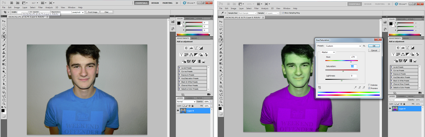
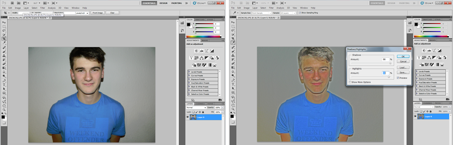
Adobe photoshop CS5 is an editing programme that allows jpeg images to be edited in many ways due to its variety of tools, this programme is the programme I used to create both my digipak and my magazine advertisement in my campaign. I was very familiar with photoshop and its tools as I had used it frequenlty in my first year of media studies, yet before I started creating my ancillary texts I wanted to refresh my skills and make sure i was fully able to use the tools to the best of their ability. I chose to use this progrmame as it was more advanced then Microsoft Publisher, that also may have enabled me to create my ancillary tetxs, therefore allowing my ancillary texts to looks as professional as possible.
Changing Brightness is a simple skill yet as I wanted to make sure I had the skills to be able to change the brightness and contrast of an image i felt like it was vital I practised the skills.
Altering the Colour Balance
Clone Tool
Changing the Hue and Saturation
Changing the image to Black and White
Altering the Shadows and Highlights
I used my New York images and altered the brightness and contrast of the images aswell as using the clone tool to match the colour of the front cover to the back cover on my second draft of my digipak. I also used the rectangular tool which allowed me to create a white box, in which I reduced the opacity, to make my logo appear more clearly on both my poster and digipak. When creating the disc for my digipak I had to layer the image sand draw a circle on top of the image. I then used the magnetic lasso tool in order to cut around the circle shape and have the shape of a disc.
I produced two drafts of a CD and DVD disc which were both created the same with technique and due to photoshop I was pleased with both images produced.
Adobe Premirepro CS6 is also an editing programme for moving image similar to iMovie but a lot more advanced. This is the program I used to create my second and third draft of my music video, this was used by myself very frequntly and after a short session with our media technician - Ray - I was able to use and locate all of the tools on the programme. I found Adobe premire pro to be just as simple to use as iMovie and found a wider range of effects and transitions that I could use in my music video. After I got back from New York I first uploaded all of my clips and viewed them to see which clips I wnated to use for my music video, after i had made this judgement i then changed the description of them to give recognition of what clip it was. This made my clips easy accessible when it came to editing and quick to locate. I was able to have two timelines running along side each other allowing me to have New York footage running over the performance footage at a reduced opacity. This made the music video look more professional and allowed me to intertwine both the performance and abstaract footage of New York. This was a feature I could not do on iMovie and the change over to the Adobe Premirepro programme proved to be a very benefical deciison. The most frequent transition I used was the cross dissolve which looked very professional and allowed a blend between the footage. Additonally it allowed the clips to be edited to the beat of the music dpeending on the duration of the transition. I also used a 'Fast Colour Correction' effect on the performance clips to create a blue colour effect over the clip, this allowed the clips to look more interesting and allowed me to keep with conventions of indie rock. I was also able to resize and change the speed and duration of this clips aswell as reverse the image. I chose this programme over alternative mediums such as Windows Movie Maker, iMovie and Final Cut pro as i felt it was much more complex programme which enabled precise editing of clips, resulting in my music video looking as preffesional as possible. I also chose to use this programme as I knew shows such as the BBC and The Tonight Show have been produced on this programme and these are well known prestigious shows with high quialty which is what I wanted to reflect in my music video.
Sony Handycam, 12 megapixel, was the camera I used to film the footage both with my original idea and my change of idea. I chose to use this camera instead of a larger HD camera as it allowed my to film on a memory card and was more compact for travelling. I was aware that the quality of my footage would not be as clear as if I used a larger camera however the camera allowed my to film in my location and wasnt as heavy as a larger HD camera may have been. This camera was easy to use and could be easily attached to a tripod allowing my shots to be stabilised. This camera was taken to my different locations of New York and was also used inside college in the green room. As I was filming I noticed that the camera took still shots as I was filming which was handy when I wanted to show the type of shots I used in filming. The Camera was easily portable and had a 4 hour battery life whilst I was in New York which allowed me to film all the footage I needed. As I walked around New York I filmed the footage by holding the camera and was able to take pans's, tilts,close up's, medium close up's and long shots which allowed me to capture all of the necessary footage I needed for my music video. This is the camera I used to also film my audience feedback on both my ancillary texts and my music video. This camera allowed me to gain an insight into how my target audeince viewed my work and what they felt worked well and what didnt. On reflection I would have liked to use a larger camera that produced better quality footage as I do not feel like the shots taken in New York were not as detailed and clear as they could have been which overall decreased the quality of my video.
Throughout my planning and research of my campaigning I used my Apple iPhone 5 to add information to my blog posts and add images I had taken in New York. During my research I also searched the social networking sites of bands from the indie rock genre to see how they marketed their material and how they promoted their materials. I used Twitter, Facebook and Instagram for this and screen shotted my findings and uploaded them to blogger via the mobile app. I also used my iPhone to play the song for my cast member to sig along to when filming the lip synchronized clips.
Additionally there were alot more techonologies that I used in the process of research and planning and the deatails of these and how I used them are featured in the slide share below. Examples of these media technologies are Web 2.0, Blogger, Microsoft Word, Prezi, Go Animate and YouTube.
Blogger was the main media technology that I used frequently in comparison to the other media technologies that I used. Using blogger allowed me to hold all of my portfolio, both planning, research and products. Once published they could be viewed by others to see my development in skills and knowledge over the duration of my project. Blogger allowed me to create a poll that allowed me to assess who visited my blog and what their interests were, this helped me define my target audience.
YouTube played a huge part in my research and additonally in gaining audience feedback from my music video. It allowed me to upload my video, draft, audience feedback and outtakes.
This was essentially my final version of my music video, yet after showing my target audience my product in a focus group they noticed that at a certain part of the song the lip sync was out of time. Additionally, there was a double exposure that they did not like and felt it didnt work well within the song, distracting them from the overall video. I took on board their comments and set too at altering these issues straight away.
My second drfat of my music video features an element of performance around the abstract New York images. I feel since taking the audience feedback into account my music video looks more like a music video now and I am very impressed with how it has turned out as a second draft. I will conduct a focus group to see what improvements I could make to my music video to make to appeal more to my target audience.


 After identifying the conventions of form I then looked at identifying the conventions of my chosen genre - Indie Rock. I conducted several analysis' of indie rock music videos to be able to identify the conventions of the setting, narrative, Mise-en-scene in relation to costume and props, editing and cinematography.
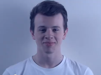


 The preferred digipak was the digipak with the central park back cover with the yellow iconic taxi, however it was suggested that the front cover could have an addition of the band name added in order for the audience to create recognition between the band and the album. So with this feedback in mind I again made the changes and created my final digipak.


 I liked the layout of the white rectangular box which featured the band name and logo directly in the middle of the advertisement therefore carried this layout over to both drafts of the magazien advertisement and to my digipak front cover. To keep with conventions of magazine advertisements I sized the album name so it was the biggest text on the advertisement to grab the audiences attention. The text on the magazine advertisement is the same font - Bebas Neue, found on 'Dafont.com'- to create continuity between the magazine advertisement and create recognition between the band name and the album name when placed on the digipak allowing the combination of my ancillary texts to work very effectively.
  I felt it was important to show both of my ancillary texts as real existing products in the industry so as well as creating edits of my album cover on iTunes I decided to create both my magazine advertisement and my digipak . I printed off my magazine advertisement and placed it inside MOJO to make it look as though it was a real product featured in the industry and asked for feedback on whether the advertisement looked believable. I got good feedback from this and felt happy that I had followed conventions correctly and had made an accurate industry looking magazine advertisement that reflected the abstract digipak and music video. I did this as an alternative way of finding an image of an open magazine and editing it on to the image as I feel this reflected the image as a real life product more effectively.


 I used my New York images and altered the brightness and contrast of the images aswell as using the clone tool to match the colour of the front cover to the back cover on my second draft of my digipak. I also used the rectangular tool which allowed me to create a white box, in which I reduced the opacity, to make my logo appear more clearly on both my poster and digipak. When creating the disc for my digipak I had to layer the image sand draw a circle on top of the image. I then used the magnetic lasso tool in order to cut around the circle shape and have the shape of a disc.

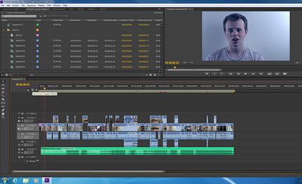 Adobe Premirepro CS6 is also an editing programme for moving image similar to iMovie but a lot more advanced. This is the program I used to create my second and third draft of my music video, this was used by myself very frequntly and after a short session with our media technician - Ray - I was able to use and locate all of the tools on the programme. I found Adobe premire pro to be just as simple to use as iMovie and found a wider range of effects and transitions that I could use in my music video. After I got back from New York I first uploaded all of my clips and viewed them to see which clips I wnated to use for my music video, after i had made this judgement i then changed the description of them to give recognition of what clip it was. This made my clips easy accessible when it came to editing and quick to locate. I was able to have two timelines running along side each other allowing me to have New York footage running over the performance footage at a reduced opacity. This made the music video look more professional and allowed me to intertwine both the performance and abstaract footage of New York. This was a feature I could not do on iMovie and the change over to the Adobe Premirepro programme proved to be a very benefical deciison. The most frequent transition I used was the cross dissolve which looked very professional and allowed a blend between the footage. Additonally it allowed the clips to be edited to the beat of the music dpeending on the duration of the transition. I also used a 'Fast Colour Correction' effect on the performance clips to create a blue colour effect over the clip, this allowed the clips to look more interesting and allowed me to keep with conventions of indie rock. I was also able to resize and change the speed and duration of this clips aswell as reverse the image.

